The NBA is rarely boring, even when there are no games to be played. There's still plenty to love about the offseason -- Twitter beefs, free agency drama, trade chatter and fallout, burner accounts, etc. There's something for everyone.
As a sports fashion lover, the offseason is also a wonderful time of year for uniform news. And with the league normalizing four-uniform sets after the switch to Nike, there's been a lot of uniform movement across the NBA landscape of late. Some teams have chosen to go in a completely different direction while others have made (or will make) subtle tweaks or additions to their lineup of uniforms for next season.
Not all of the new uniforms have been officially unveiled yet, but let's examine the ones that have been, plus rank them from best to worst.
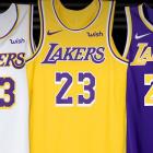
1A. Los Angeles Lakers (Icon)
The Lakers are one of the premier franchises in basketball -- rich with history, tradition and success. They've also got one of the better color schemes and logos in basketball, so they've got a history of great uniforms as well. And while the modernized uniforms that were introduced in the Shaq/Kobe era certainly weren't awful, they eventually became a little stale and suffered from not having a more classic feel. (Disclaimer: I typically have aversion to wishbone-collared jerseys.)
It was extremely smart to hit the refresh button as they begin the LeBron James' era in Los Angeles, and it was even smarter to revisit the rich history of the team and draw from classic elements of a great Lakers jersey to inspire the new look. The new "Showtime"-inspired unis deliver.
An ICONic look.
— Los Angeles Lakers (@Lakers) July 31, 2018
🛍: https://t.co/jkt227nswb pic.twitter.com/cD3ARA184u
I'll give a slight edge to the gold Icon jerseys simply because the Lakers' tradition of wearing gold at home (especially when most teams used to exclusively wear white at home) is one of the cooler things about the franchise. The gold look has become a Lakers staple and it's hard to imagine them ever moving away from the gold jersey at this point.
Luckily, the new update does it justice. It's clean as hell and they play the gold, purple and white off each other well in the striping. This is what a Lakers jersey should look like.
1B. Los Angeles Lakers (Association)
When the Lakers introduced a white iteration of the modern style jersey in the early 2000s, it felt somewhat wrong. While it was a good-looking jersey and didn't particularly shame the team's brand, it just felt foreign for the Lakers to be wearing white instead of their usual gold at home. Again, the gold home unis were part of what make the Lakers feel special.
But as the years went on, the white Lakers look became more palatable. Maybe it's because we got used to it, or that NBA teams started introducing more and more jerseys into their rotation, or that the Lakers went on to unveil worse looks (i.e. their black jerseys). At this point, it seems fair to just expect and accept a white jersey with the Lakers' set.
It becomes a lot easier when they're as hot as this one.
Put on in the ASSOCIATION.
— Los Angeles Lakers (@Lakers) July 31, 2018
🛍: https://t.co/cW50Xvof7G pic.twitter.com/MHQzl0zFos
These are just as good as -- dare I say, maybe even better than -- the gold version. The striping looks great. The wordmark and numbers seem to pop a little more on the white jersey than they do on the gold.
For whatever reason, this white jersey actually feels like a true Lakers jersey, not just a white knockoff of the classic gold look. But even while it might look just a little better, tradition makes it hard to say it's preferable over the gold.
2. Orlando Magic (Classic)
As part of the team's 30th anniversary season, the Magic have announced that they will wear their classic '90s blue pinstriped uniform as an occasional throwback. The uniform was worn on the road for four seasons from 1994 until 1998 and is most famously tied to the Magic's glory days with Shaquille O'Neal and Penny Hardaway.
Not only does the look represent one of the most successful eras of Magic basketball, but it's also one of the better throwback looks from that era. The pinstriped jersey (both the blue and black versions) is the best look the Magic have ever sported -- and simply one of the better ensembles from from that era -- so it's exciting that they're bringing it back, even if it's just on a limited basis.
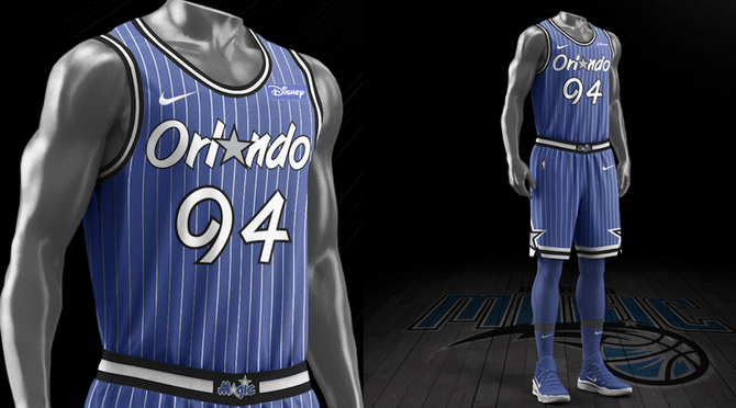
The Magic have struggled to find relevance over the past handful of years, so maybe the reintroduction of the pinstripes will shoot some good vibes back into the organization and help them rediscover success. You've got to start somewhere.
3. Atlanta Hawks (Classic)
The Hawks be celebrating their 50th anniversary in Atlanta by bringing back an original from 1968. The gorgeous powder blue and red uniforms uniforms were worn after the franchise relocated from St. Louis to Atlanta, and they're going to be a welcome addition to the NBA this season. Powder blue is a pretty strong weapon when it comes to throwback jerseys, and this one packs a punch.
Atlanta Hawks 1968 Retro Uniforms team will wear this season to celebrate 50 years in the city. pic.twitter.com/H1v38X8jxD
— Darren Rovell (@darrenrovell) August 16, 2018
The throwbacks will fall under Nike's "Classic" designation, meaning that the Hawks will wear five total uniforms throughout the course of next season. It's not yet known how many times the Hawks are planning on wearing the retro look. Hopefully it's at least a handful of times, considering this look is arguably better than anything else the Hawks have in their current arsenal.
4. Denver Nuggets (Statement)
It seems like the Nuggets have tweaked their look quite a bit over the past decade or so, and they've decided to make a change again this summer -- this time a pretty drastic one. They're moving away from powder blue as their primary color and going with a navy, red and yellow color scheme that resembles their look from the 1990s and early 2000s.
Overall, the Nuggets' rebrand was pretty underwhelming, but there was one uniform in their three-look set that stood out -- this very different Statement uni.
Statement.#EVOLVE2018 pic.twitter.com/vvkLLH7XEw
— Denver Nuggets (@nuggets) June 7, 2018
It's reminiscent of the current Indiana Pacers uniforms in that it has somewhat of a classic feel blended with modern elements that make it a unique hybrid. Like the Pacers' unis, the circular wordmark around the number on the front of the torso is a cool feature, but the highlight of the uniform might be the shorts, which feature the miners logo with a silhouette of the Rocky Mountains.
Denver's new uniform set is sort of all over the place, but at least they did well with this one.
5. Charlotte Hornets (Classic)
Maybe this is a hot take, but I feel like the classic Charlotte Hornets look is a tad overrated. It seems like nostalgia skews things because there's a certain level of comfort in familiarity, and the Hornets have been generous is feeding that hunger for nostalgia over the past few years.
A year after bringing back their original '90s teal uniform on a limited basis, the Hornets announced that they'll be using the white iteration of that classic '90s as alternate jerseys next season. It's a move that makes sense, as the Hornets will bring it back as part of their 30th anniversary season. They're doubling down on the nostalgia, so to speak, as they'll play on a throwback court design whenever they wear the Classic jerseys.
🔥 HERE IT IS 🔥 Introducing the new white Classic Edition uniform to be worn during the 2018-19 season when the franchise celebrates the 30th Anniversary of the inaugural 1988-89 Hornets season!
— Charlotte Hornets (@hornets) July 25, 2018
👉🏼 https://t.co/WtMFnc33fR #Hornets30 pic.twitter.com/al1wL9fEzf
While I do think time has made a lot of hearts grow fonder of the classic Hornets look, it is a pretty fun jersey and it'll be cool to see it revisited this season. However, I still think we already saw the much superior version of that classic look with the teal last year.
6. Minnesota Timberwolves (Classic)
The Wolves are also revisiting the '90s with their Classic jersey this year. They'll bring back a version of their black alternate uniform that they wore from 1996-2008, the one synonymous with the Kevin Garnett and Stephon Marbury era Minnesota teams, as part of their 30th anniversary season. That jersey's most notable feature is the unique pine tree design in the trim.
Classics. pic.twitter.com/XfepYTBOfF
— Timberwolves (@Timberwolves) August 30, 2018
It's a pretty solid look overall and I definitely don't hate that it's coming back. However, the team offered up a poll to decide which uniform would make a comeback, and I'm severely disappointed that this uni won instead of the Timberwolves' best look by far -- their original look from 1989-1996.
7. Denver Nuggets (Icon)
I don't think this Nuggets jersey is terrible, but it's definitely not spectacular either. I like its intentions -- a simple, minimalistic look that attempts to make white and yellow pop on the navy jersey -- but the execution isn't great. It's not surprising that I don't love the wishbone collar, but it also feels like the white striping is too heavy and could have been complemented with some yellow. The wordmark is pretty generic and looks like something you'd see from a mid-level college team.
Icon.#EVOLVE2018 pic.twitter.com/3B6asIUvjZ
— Denver Nuggets (@nuggets) June 7, 2018
Once again, I'm impressed with the shorts but, overall, this look is nothing special.
8. Denver Nuggets (Association)
This one just feels all over the place. All of my criticisms from above ring true with these jerseys as well, but the way that the navy, red and yellow color scheme is arranged in this jersey just makes it feel like a Cavaliers uniform (not a compliment), yet somehow worse.
Association.#EVOLVE2018 pic.twitter.com/ktEQ21w9Qw
— Denver Nuggets (@nuggets) June 7, 2018
It seems like the Nuggets are constantly going through an identity crisis, searching for a look that will satisfy them and help them settle into their place in this league. Unfortunately, they seem to consistently miss the mark. Maybe one day they'll figure it out, but this look probably isn't going to get the job done. They'd probably be best served just to go with the rainbow skyline look full-time.
9. Los Angeles Lakers (Statement)
I actually don't think that the Lakers' purple uniform is the very worst looking jersey to be unveiled this summer, but it's definitely the most frustrating and that's why it ranks so low. All the Lakers had to do was follow the blueprint that was set by their gold and white iterations and the purple version would have been amazing. All three of the looks would have been exceptional.
But they had to go and screw it up for some inexplicable reason.
Make a STATEMENT.
— Los Angeles Lakers (@Lakers) July 31, 2018
🛍: https://t.co/AiHqfXNcRI pic.twitter.com/CTNF92QYGH
The purple Statement jerseys are spoiled by the black stripe that runs down the side of the uniform -- an element that doesn't exist in the other two versions. Thankfully.
It's so unnecessary and out of place and, as a result, the uniform actually looks pretty silly once you see it from the side. It looks like the side of the jerseys are cut out and the players are wearing them like an apron with a black tank underneath. Hopefully that gets fixed at some point down the line.